Absolute Vs. Fix Vs. Relative Positioning In CSS: What Are Their Differences?
Absolute, Fixed, and Relative positioning are all CSS positioning properties. But they all have different applications. Each one is useful in certain situations.
It’s important to understand the best methods to position HTML elements on a webpage. It ensures that they are accessible and look attractive to the reader.
The best positioning option for your website will come down to what you’re hoping to achieve. So, consider your options before deciding on a positioning strategy.
Also, it’s vital to understand the relationships between document flow and CSS positions. It’s the first step in comprehending the impacts positioning has on how HTML elements take up available space on a webpage.
The Position Property In CSS
This CSS property specifies the method of positioning elements on a webpage. The CSS uses a set value to declare the positioning property. The values are:
- Static
- Absolute
- Fix
- Relative
- Sticky
Static positioning is the default method of positioning elements with CSS.
The sticky positioning is a new CSS value. Sticky positioning assumes the characteristics of relative and fixed positioning depending on the scroll position. Elements with sticky positioning will be positioned relative until a specified offset position is reached in the viewport, at which it becomes fixed or sticks.
Before using the sticky positioning be sure to confirm the browsers that support it.
What Is Relative Positioning?
The relative positioning offsets elements according to their original position. It uses CSS properties to move them around the page.
The properties are: top, bottom, left, and right. They can carry a positive or negative numerical value.
Top
This property offsets elements against the top of their original position. For example, setting its value to 50px will position them down to 50px from its original position.
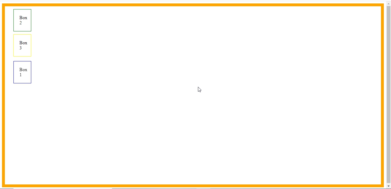
Let’s offset Box 3 with relative positioning.

The boxes’ positions before applying the code
.box {
  position: relative;
  top: 50px;
}
Now, let’s see the effect of the above code on Box 3

The code offsets Box 3 by 50px against the top of its original position.
Bottom
This property offsets elements against the bottom of their original position by the value you set.
.box {
  position: relative;
  bottom: /* set the value of the offset here*/ ;
}
Left
This property offsets them against the left of their original position.
.box {
  position: relative;
  left: /* set the value of the offset here*/ ;
}
Right
The property offsets elements against the right of their original position to position them.
.box {
  position: relative;
  right: /* set the value of the offset here*/ ;
}
What Is Absolute Positioning?
For this method, you need two elements, which are the parent and child elements. The absolute positioning method offsets elements relative to their parent elements.
The absolute positioning also uses similar keywords to the relative positioning to move elements.
Note!
The position of the parent element should be set as a relative value. If not, the child element will be offset relative to the page.
Top
This property offset elements against the top of the parent elements.
For example, setting the property value to 200px will position elements 200px from the top of the parent element.
Let’s offset Box 1 with absolute positioning

The boxes’ positions before applying the code
.parent {
  position: relative;
}

.box {
  position: absolute;
  top: 200px;
}
Now, let’s see the effect of the above code on Box 1

The code offsets Box 1 by 200px against the top of the parent element( the orange border). Box 2 and box 3 slide up due to document flow.
Bottom
This property offsets the element against the bottom of the parent element.
.parent {
  position: relative;
}

.box {
  position: absolute;
  bottom: /* set the value here */ ;
}
Left
The left property offsets them against the left of the parent element.
.parent {
  position: relative;
}

.box {
  position: absolute;
  left: /* set the value here */ ;
}
Right
This property offsets elements to the right of the parent elements.
.parent {
  position: relative;
}

.box {
  position: absolute;
  right: /* set the value here */ ;
}
What Is Fix Positioning?
The fixed positioning offsets elements according to the browser page. It is like absolute positioning, but the parent element is the viewport (browser page.)
The keywords are the same as relative and absolute positioning.
Top
This property offsets elements against the top of the viewport according to the specified value.
For example, setting the property value to 200px will place them 200px from the top of the viewport.
Let’s offset Box 1 with fixed positioning

The boxes’ positions before applying the code
.box {
  position: fixed;
  top: 200px;
}
Now, let’s see the effect of the above code on Box 1
The code offsets Box 1 by 200px against the top of the viewport. Box 2 and box 3 slide up due to document flow.
Bottom
This property offsets elements against the bottom of the viewport.
.box {
  position: fixed;
  bottom: /* set your offset value  here*/ ;
}
Left
This property offsets elements against the viewport left side.
.box {
  position: fixed;
  left: /* set your offset value here*/ ;
}
Right
This property offsets elements against the viewport right side.
.box {
  position: fixed;
  right: /* set your offset value here*/ ;
}
Differences Between Absolute, Fixed, and Relative Positioning
Web developers use these positioning properties to control the spatial relationship of elements on a page.
But how do you decide which one to use for your projects?
The table below shows the differences among these properties and how they can affect your web design.
| Criteria | Relative | Absolute | Fixed |
| Method | Offsets elements against their original position. | Offsets elements against the nearest parent element with a position. | Offsets elements against the viewport. |
| Elements required | Only the box elements. | Parents and box elements. | Box elements. |
| Affects document flow? | No | Yes | Yes |
| Reference point | Original position. | Parent position. | Viewport. |
Document Flow in CSS Positioning
The CSS document flow is an algorithm that determines the order in which CSS boxes display in the document.
Using the CSS positioning property modifies the document flow of the elements. The effects depend on the property used.
Depending on the display property, HTML elements are either in-block or in-line. The block format arranges elements vertically, and the in-line positions them horizontally.
Examples of block elements are div, paragraphs, and lists. The in-line components include images, links, and inputs.
Relative Document Flow
When relative positioning offsets an element, it doesn’t affect the document flow. It means the remaining elements will keep their position after offsetting it from its flow.
That is, it keeps the document flow and leaves a blank space where the box resided.
Absolute and Fixed Document Flow
When absolute or fixed positioning offsets an element, it can change the document flow. It means the remaining elements will occupy the vacant position after offsetting it from its flow.
Conclusion
As a web designer/developer, you’ll encounter the CSS position property at some point. It’s a helpful tool that allows you to specify how and where an element will appear on the page.
Want to learn more about this property? Consider taking a CSS course on Sololearn’s website. We offer a complete CSS course and other programming languages.
References
What is document flow? (n.d.). Retrieved August 24, 2022, from https://soulandwolf.com.au/blog/what-is-document-flow/
Chan, J. (2020, March 23). CSS position property: Relative, absolute, static, fixed, sticky. Medium. Retrieved August 24, 2022, from https://levelup.gitconnected.com/css-position-property-relative-absolute-static-fixed-sticky-79a40275ed04